Advisor Copilot · Product Design Case Study
Turning an AI assistant into an operational workspace advisors trust.
Product Designer · CogniCor Technologies · ~2.5 years, ongoing
A CRM-embedded AI platform for wealth management. As its product designer, I led the shift from a chat-gated tool to a unified workspace.
The Opportunity
The platform was fragmenting faster than it was scaling.
Advisor Copilot had grown into a set of disconnected AI tools — each added in isolation, each with its own navigation. Priced per user and per module, fragmentation wasn't just a UX problem: low adoption meant engineering spend with no return, and real renewal risk.
The real problem wasn't the screens — it was that advisors had no single place to work. So the bet was a unified workspace, embedded where they already spend their day: inside Salesforce and Redtail — against a market building point solutions, in a category that largely formed after this work began.
My Role
How I worked without a design team.
I'm the product designer on this platform — I take a product from zero to maturity, then hand it off when the next 0→1 needs me. That's exactly what happened with ClientMeet: stable and owned by a teammate while I build the next module from scratch. The strategy was a combined effort — advisor insight reached the work through stakeholders (CEO, CTO, PMs) who met with advisors regularly, while the domain and competitive intelligence was my own: I tore down competitor products area by area and got domain-fluent through industry writing and voices like Michael Kitces, so I could drive positioning and UX strategy, not just execute a brief.
“Sole designer” usually raises a fair question: where's the critique, the pushback, the quality bar? I built that loop deliberately.
The Starting Point
A chat-gated tool the market wouldn't buy.
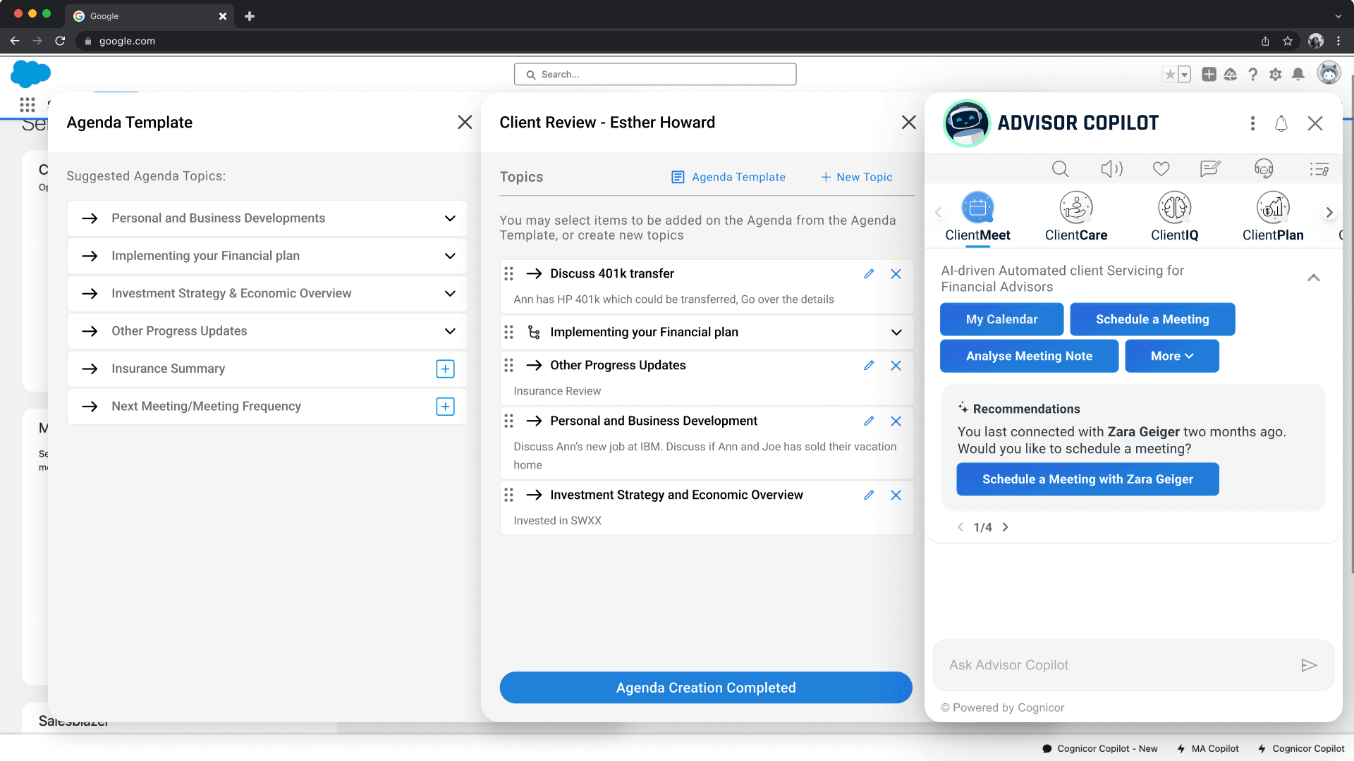
The company's identity was chat-first, and the first product reflected it: every advisor action ran through a linear, gated chat flow. You couldn't skip a step, jump between tasks, or explore — and if you broke the flow, you started over from the beginning.
The information architecture was unreadable — no one could tell where a flow began or ended. It was data-starved and space-hungry, and in demos it wasn't landing enterprise clients.
The Pivot
Chat as a mode, not the mandate.
Leadership wanted to go fully chat-driven. I pushed back — not on chat, but on chat as the whole product.
Two problems. Technical: with this many connected systems feeding context, real-time contextual chat was slow and unreliable. Commercial: chat-only was the exact model that hadn't sold.
So I made the failure the argument. I proposed a bridge, not a reversal — a workspace built around a persistent panel, with chat kept as a toggle: one click away, always available, but no longer the gate advisors had to pass through.
In a high-trust domain, you don't force every action through a probabilistic channel. That reframing is what moved the room.
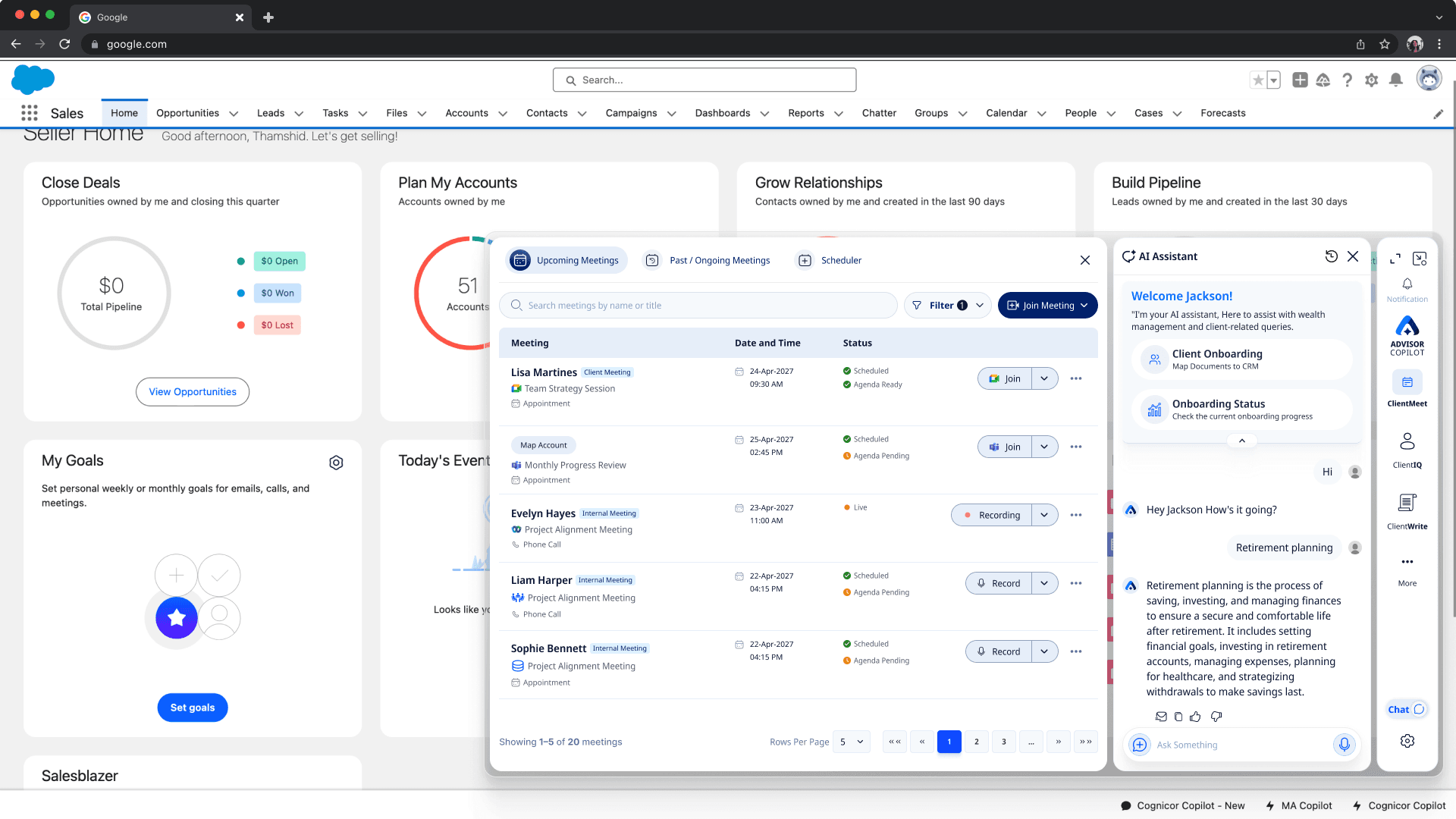
← Drag to compare · same CRM, same advisor, two products →
The platform began landing enterprise clients after the pivot. I won't claim design alone closed those deals — the AI underneath was improving in parallel — but the chat-gated model couldn't sell, and the workspace could.
The Architecture
One pane, not stacked gates.
The old approach stacked gated modals on top of each other — the same cramped pattern from the starting point — and every module would have inherited it.
The decision was a single persistent pane: a left rail of sections and navigation plus one working surface, so you never stack or gate. This is the platform-level pattern every module inherits— ClientMeet, ClientCare, ClientIQ, all of it — and it's what makes five products feel like one.
Before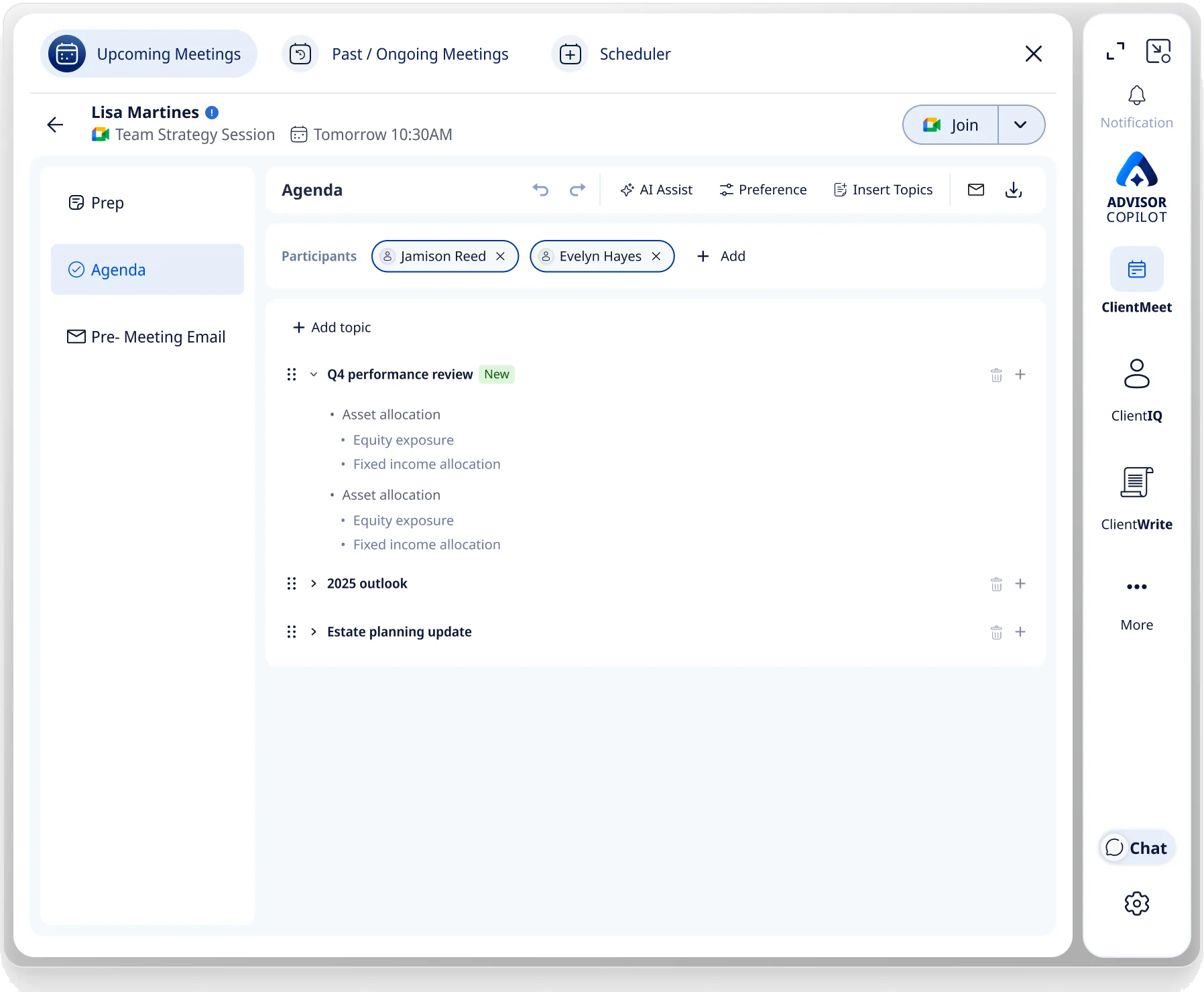 After
AfterThe gated-stacking pattern that failed at the product level would have repeated in every module. One persistent pane, with a section rail instead of stacked gates, became the architecture all five products share.
My Point of View
In a high-trust, compliance-bound domain, the human's job is to verify the AI's work — not to coax the AI into doing it.
Designing AI where trust is everything follows a few consistent principles:
Every module decision below is an application of these.
The Signature Constraint
A full workspace — at 790px, inside someone else's CRM.
The product lives as a panel embedded in Salesforce or Redtail: a full operational workspace squeezed into someone else's CRM, with no room to spare — density-tested on 13–14″ laptops from day one.
Stakeholders pictured a small assistant beside the CRM, and the pilot agreed — advisors liked the compact default. So the constraint became the design: every layout has to earn its width.
It's compact at 790px by default and maximizes when the work needs room.
The Embedded Constraint
Rebuilding what the browser gives you for free — in a fraction of its room.
Advisor Copilot runs as a panel inside a Salesforce iframe, so the browser's built-in behaviors aren't available — I rebuilt them by hand. The catch: a browser's chrome sits around the page. Mine had to live inside it.
The compounding cost
Every control I added — back, breadcrumbs, history, actions — came out of the content area, not a browser frame around it. A persistent top bar and action row ate height; navigation ate width. Rebuilding the browser squeezed the workspace on both axes at once.
And it did so inside the 790px that was already the scarcest thing I had — so the constraints compounded. Every pixel of rebuilt chrome was a pixel of client work lost.
No back button, so I built navigation in the panel
In-app history, breadcrumbs and a back that returns you exactly where you were.
The browser's back button, rebuilt inside the panel.
A refresh reloads Salesforce, not us — so nothing is lost
Draft-saving and state restoration hold the advisor's place through a host-page reload.
In-progress work survives a refresh it can't control.
The same constraint also shaped
- The panel can't resize the browser — so I built resize into the panel.The 790px workspace
- A modal can't escape the iframe — so the architecture had to live in one pane.One pane, not stacked gates
ClientMeet
The module that proved the model.
ClientMeet was my first build and the most adopted. It restructured the entire meeting lifecycle — prep, in-session, follow-up — around how advisors actually work.
Three decisions shaped it — how you navigate it, how it preps you for a call, and how it records what happens. Each one started from a real advisor behaviour, not a spec.
Three tabs instead of one gated flow.
The platform pattern gave me one persistent pane. The module question was how to structure the meeting lifecycle inside it. I split it into three tabs — Upcoming, Past / Ongoing, and Scheduler — matching how advisors actually move through their day rather than a single linear flow. An advisor can jump from prepping tomorrow's meeting to reviewing last week's without losing their place.
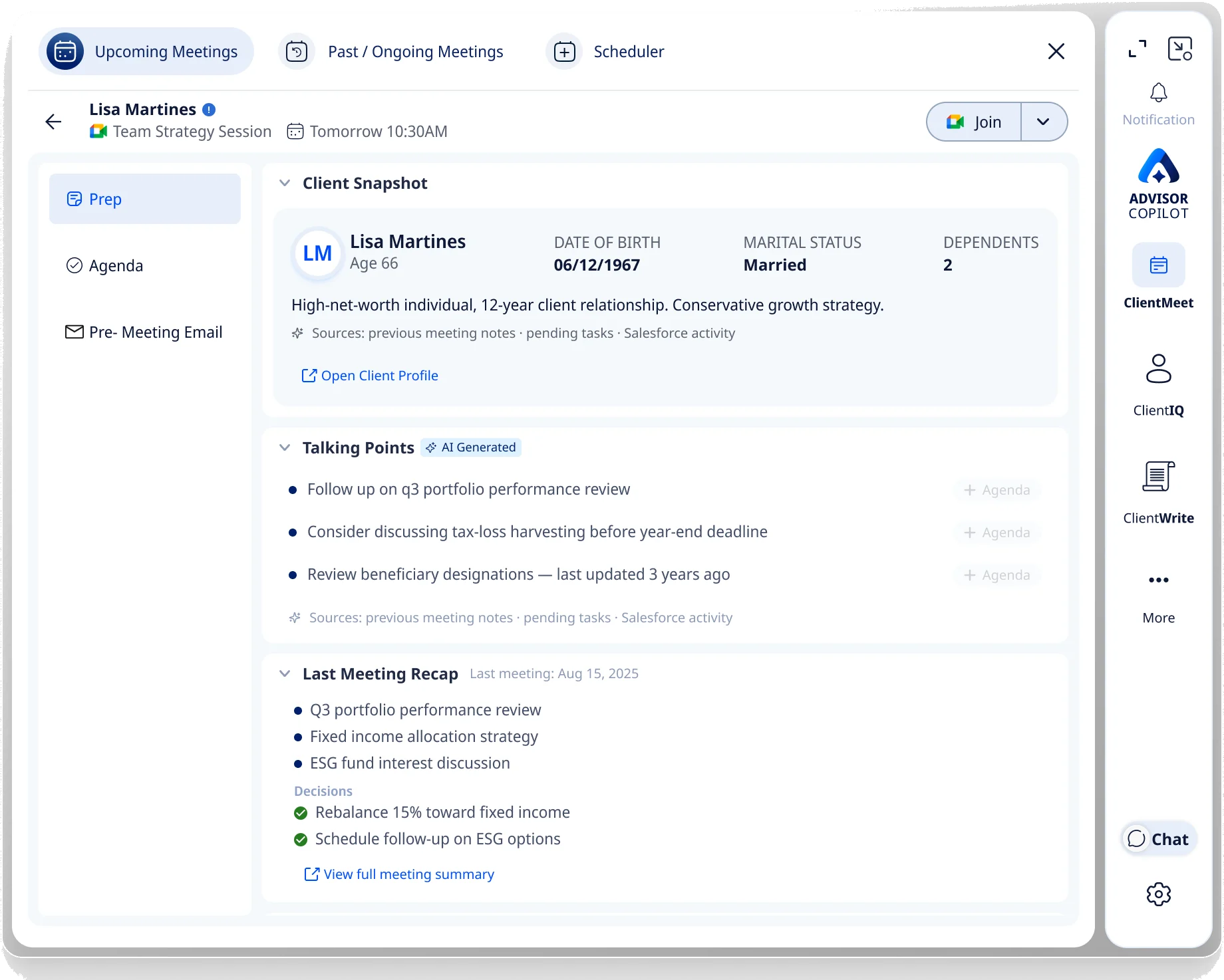
A prep screen that collapses four tools into one glance.
From a single Upcoming-meeting view, an advisor revises the whole client in the few minutes before a call — an AI snapshot, talking points, the last-meeting recap, a one-click pre-meeting email, the join button. The restraint was deliberate: the deep financial position lives one click away in ClientIQ. I could surface twenty things; the advisor has two minutes, so I showed the few that change how the meeting opens.
The signature view
1234- 1Client Snapshot — AI key params, life events, sentiment
- 2✦ Sources — every insight traces to its origin
- 3Talking Points — AI-generated · one click to the agenda
- 4Last-meeting recap — decisions, carried forward
Making recording globally accessible.
I'd originally put in-person recording in its own dedicated transcriber tab. During the pilot — and in my own QA — I kept struggling to findit: it blurred with the Past Meetings tab, and advisors didn't know where to look for a summary. A record feature has to be reachable instantly, or it goes unused. So I pulled recording out into a globally accessible action available at any depth — and it later became the home for online meeting-join-by-link and phone-call recording too.
Record lives in the Join Meeting control — the same top-right slot, at every depth.
The fix in one line: a control buried in a dedicated transcriber tab (blurred with Past Meetings, unfindable) → one global action reachable at any depth.
Throughout, I designed for a quieter advisor anxiety — “did the AI actually capture this?”— by having the system prove itself through delivery: summaries landing in the advisor's inbox without them needing to reopen the product.
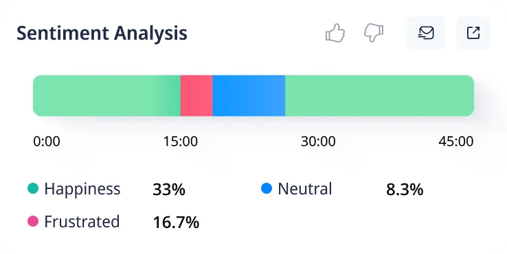
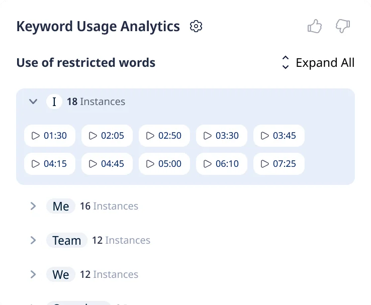
I also drove the strategy for compliance keyword tracking — flagging sensitive language in recorded client conversations, with timestamped evidence — part of keeping the platform defensible in a regulated environment.
Across ~60 advisors, Plancorp reported reclaiming 30–45 minutes of prep per meeting and about an hour of follow-up work — 3–10 hours/day at the team level. Full metrics below.
ClientCare
Built from zero.
ClientCare is the operational backbone — client-servicing workflows — architected from nothing. Because every data source was already connected, the advisor's job was never to fill a form. It was to review one that arrived mostly complete.
Pick a workflow — watch it populate from connected data, leave a couple of fields for the advisor, and go straight to signature.
Pick a servicing workflow
Agentic chat → a form.
It was scoped as an agentic, chat-based builder. But because the platform already had every data source connected, the advisor's real job wasn't generating data — it was vetting it. A structured form lets them review and confirm faster than a conversation can, so I changed direction to a form — the same point of view as the AI panel: verify, don't coax.
Scaling the build
Having chosen a form, the question was how to scale it.
The answer became the builder — and then a shared library on top of it: configure once, propagate everywhere.
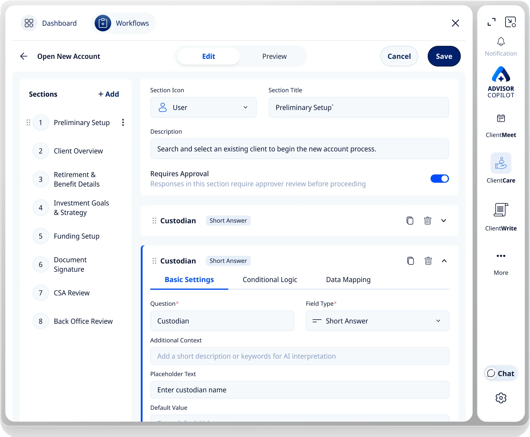
Hand-coding a bespoke workflow per client doesn't scale and buries engineering forever — so I built the builder first: configurable workflows instead of bespoke ones.
Firms share most of their fields, sections and workflows. A library layer lets an ops team change a common rule once instead of across ten workflows.
The Payoff
Admin stopped being data-entry and became review.
Before
Manually filling forms field by field, after — or without — a call.
After
The form arrives pre-filled from connected data. The advisor vets it, completes the few remaining fields, and sends to e-signature — directly in Copilot.
ClientIQ
Making a generative model something advisors can trust.
ClientIQ answers questions across everything known about a client. But it runs on a generative model — the output isn't fixed, and it isn't guaranteed. So the design problem was never the screens. It was trust.
Before designing the experience, I worked with the dev to align three things — what the model can actually produce, what compliance and the business require, and what the advisor can trust. The interface then had one job: make probabilistic output feel dependable.
Confidence, stated — including when it can't score.
A generative answer can be wrong with total fluency. So every insight carries how sure the model is — High, Medium, Low — and, honestly, a Not-scored state when there isn't enough to stand behind. The advisor calibrates trust per answer instead of assuming all output is equal.
Client is likely nearing a required minimum distribution — review before year-end.
Every answer carries its confidence — honestly, including when it can't score:
Every output shows its evidence — and where it lives.
No claim floats free. Each answer carries the sources it drew from and the exact location — the Salesforce field, the meeting note, the page of an uploaded statement — so the advisor can verify at the origin in one click, not take the model's word for it.
“ESG-screened funds are 18% of the portfolio.”
- Salesforce·Holdings · Account ••4471
- Meeting notes·Aug 15, 2025
- Uploaded statement·Q2 PDF · p.3
Every figure links to where it lives — the advisor verifies at the origin, in one click.
Handling how generation actually misbehaves.
Generative models repeat and duplicate themselves. Rather than surface the raw stream, I worked with the dev to detect near-identical output and collapse it — so the advisor reads one clean, de-duplicated answer, not the model thinking out loud.
Model returned
Advisor sees
The point of view, proven
ClientIQ is where verify, don't coax and sourced by default meet their hardest test — applied to output that is probabilistic by nature.
None of it could be solved in Figma alone. The model's real behaviour was a design input, mapped with engineering — and its limits became the interface's honesty.
The Full Platform
Five products, one workspace.
Beyond the three lead modules, I shipped two more on the same foundation — AdvisorIQ and ClientWrite — each reusing the workspace patterns, navigation, and AI-trust conventions, so advisors learn the platform once, not five times.
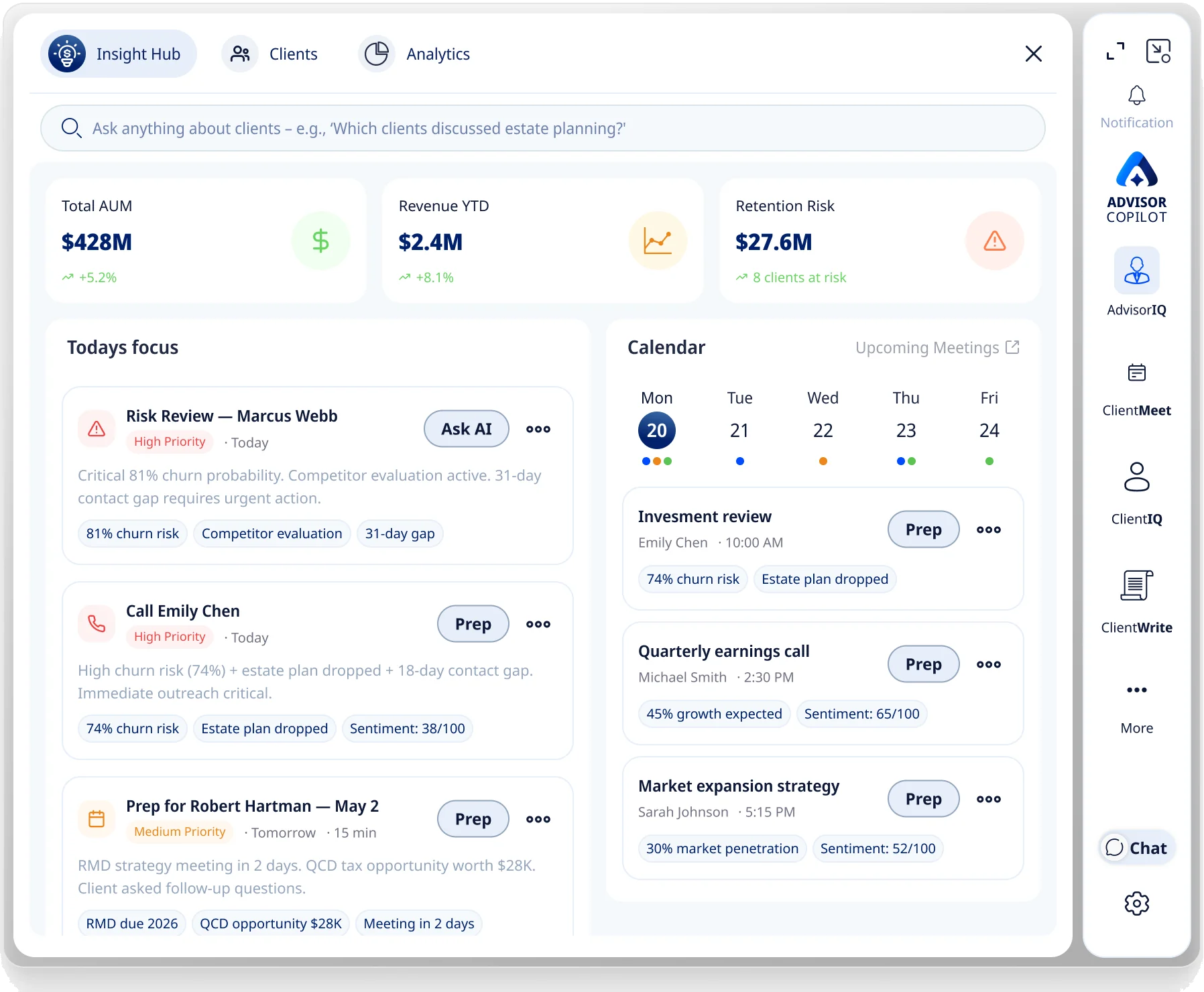
Query your whole book in natural language
A prioritized day from all signals
Satisfaction tracking → catch & follow up
The Design System
Leverage, not a library.
Scaling one designer across five 0→1 products isn't possible without a systematized pattern language. My workspace direction created the need for one, and my workspace patterns became its backbone — so each new product was cheaper than the last: it inherited a working language instead of inventing one.
It's a shared, cross-team asset. Below is the part I own — the tokens and patterns my workspace direction contributes to the system.
Color
Navy — primary ramp
Accent
Neutral
Brand
Type scale
Spacing
Radius
Elevation
Components & states
Button
Source chip
Section-rail item
Input
One component, every module
The same card and source chip — unchanged — across three modules. New products inherited the components instead of rebuilding them.
Impact
What the workspace changed.
All figures reported by Plancorp Wealth Management — measured across ~60 advisors and 17 efficiency metrics. Internal analysis, reviewed and approved by Plancorp compliance, Jan 2026.
Recovered across the advisor team — the compounding total of prep and follow-up given back, every day.
Plancorp chose the approach partly because it links every insight to its source and keeps the advisor in control — the verify-don't-coax model, validated by a fiduciary firm's own compliance review.
It felt as though the advisor had known them for years.
If I Had More Time
What I'd do next.
Firsthand research across advisor segments
My domain and competitive research was rigorous, but I relied on stakeholders for direct advisor contact. I'd run my own structured sessions — junior vs. senior, independent vs. enterprise — and catch the edge cases earlier.
Built the workspace case sooner
The evidence that moved leadership already existed in the failed prototype and the technical constraints. I'd assemble that argument earlier next time, rather than letting it accumulate.
Onboarding that teaches itself
We prioritized capability over discoverability, so onboarding came late. I'd design contextual first-run guidance into each module from the start, so advisors find features without separate training.
A self-serve lightweight tier
The deep CRM integration is what makes the platform valuable to enterprise firms — and it's why they stay. But that same complexity is a barrier for the independent advisor. I'd explore a lightweight, self-serve version with simple integrations and fast onboarding, so a single advisor could adopt it directly — expanding the market without diluting the enterprise product.
Reflection
Designing enterprise AI isn't about adding more intelligence to the screen. It's about building an operational system where workflow, context, and assistance work together — and the person in a high-trust seat can always verify, override, and stay in control.
Advisor Copilot · Product Design Case Study